


Gaman
From Korea to the daily routine.
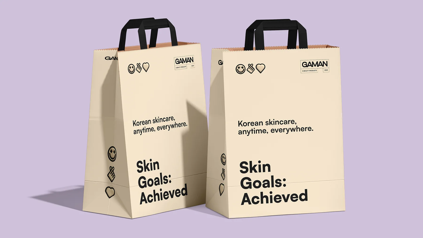
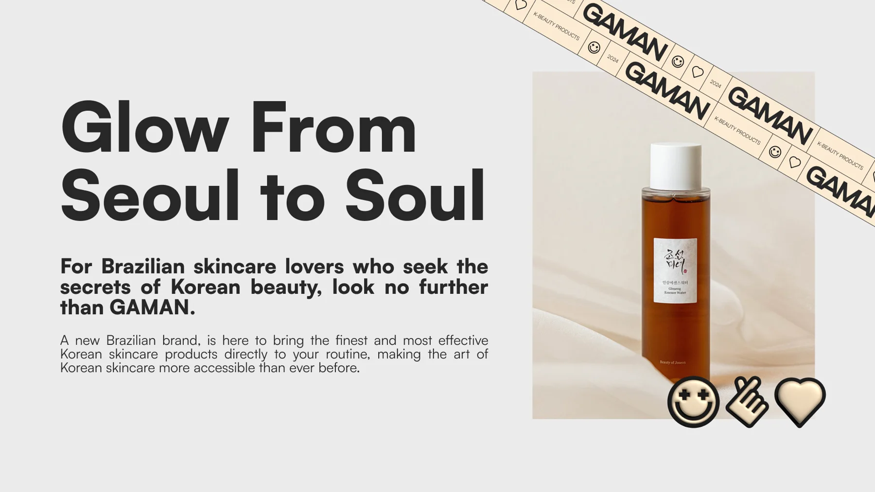
Gaman is an online Korean skincare shop that wants to bring daily skin care to more people. It brings together products for different needs and makes them more accessible through a youthful, simple and welcoming voice.
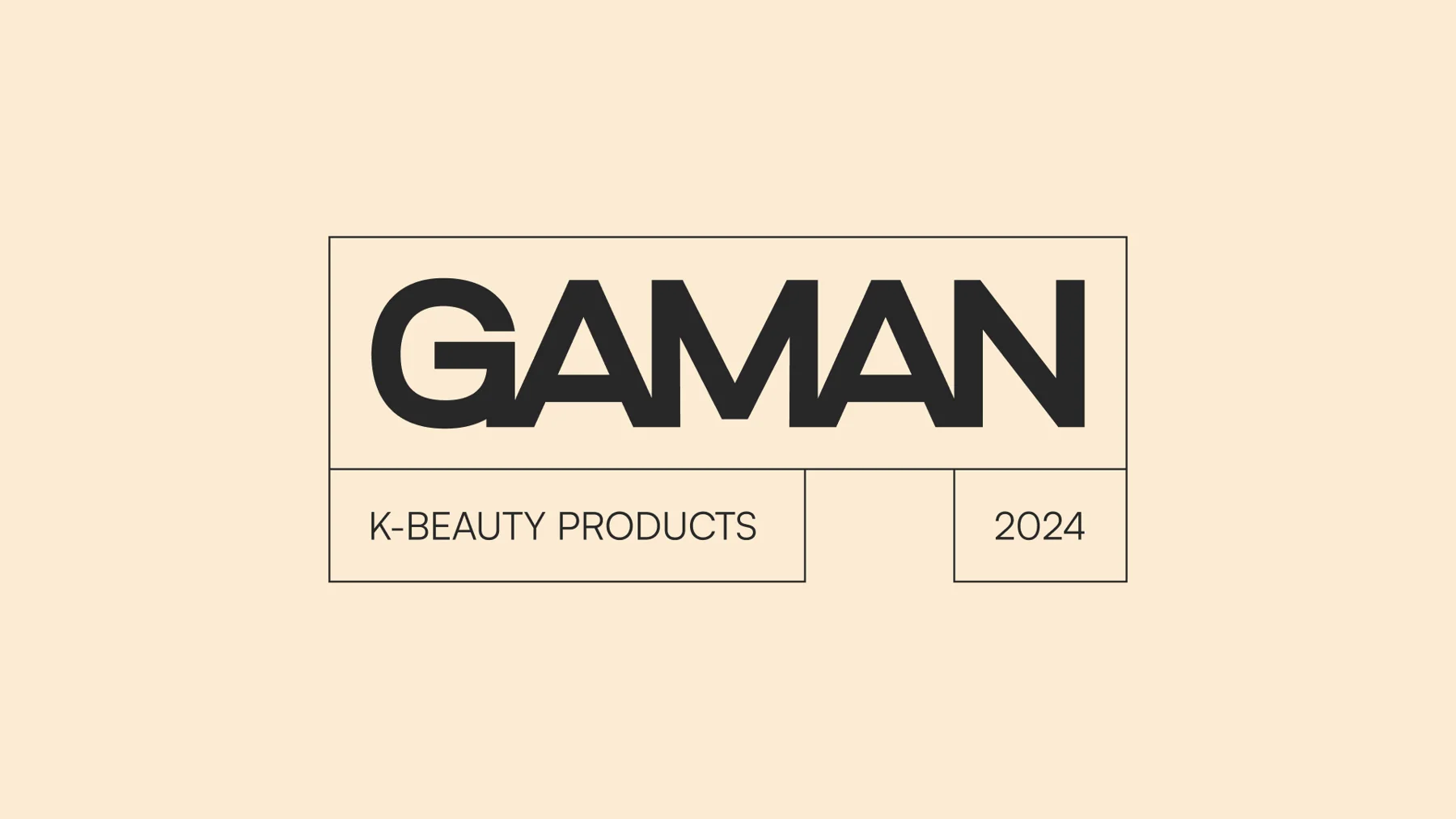
The challenge was to create a recognisable identity for a shop that presents products from other brands. Gaman needed to be known for how it selects products, communicates and helps each person choose, building a relationship that continues after purchase.
Colour brings care closer
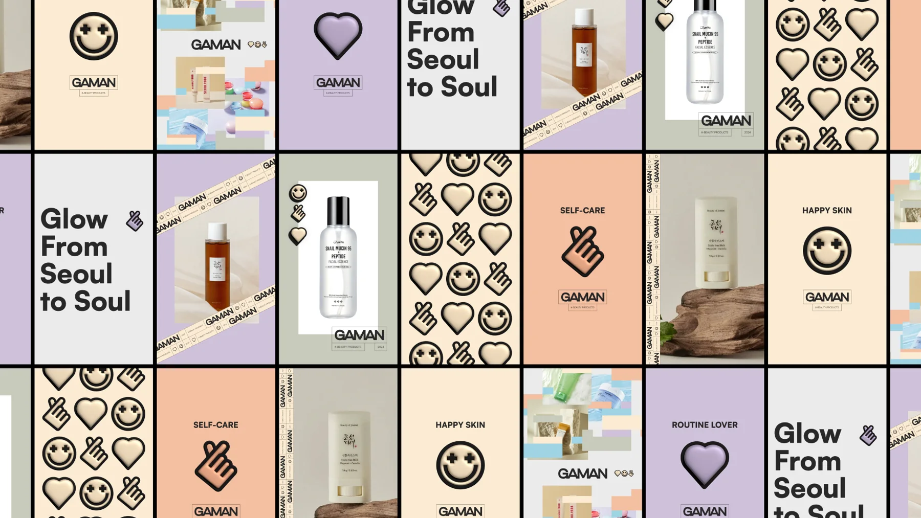
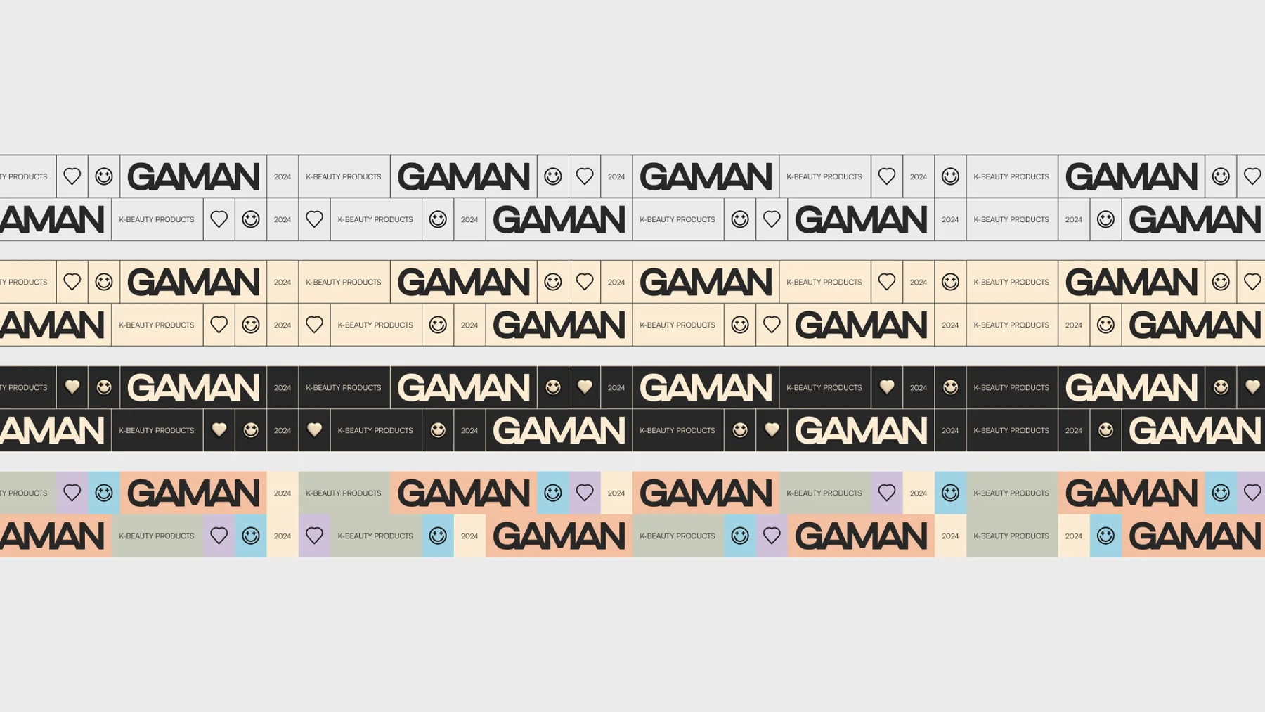
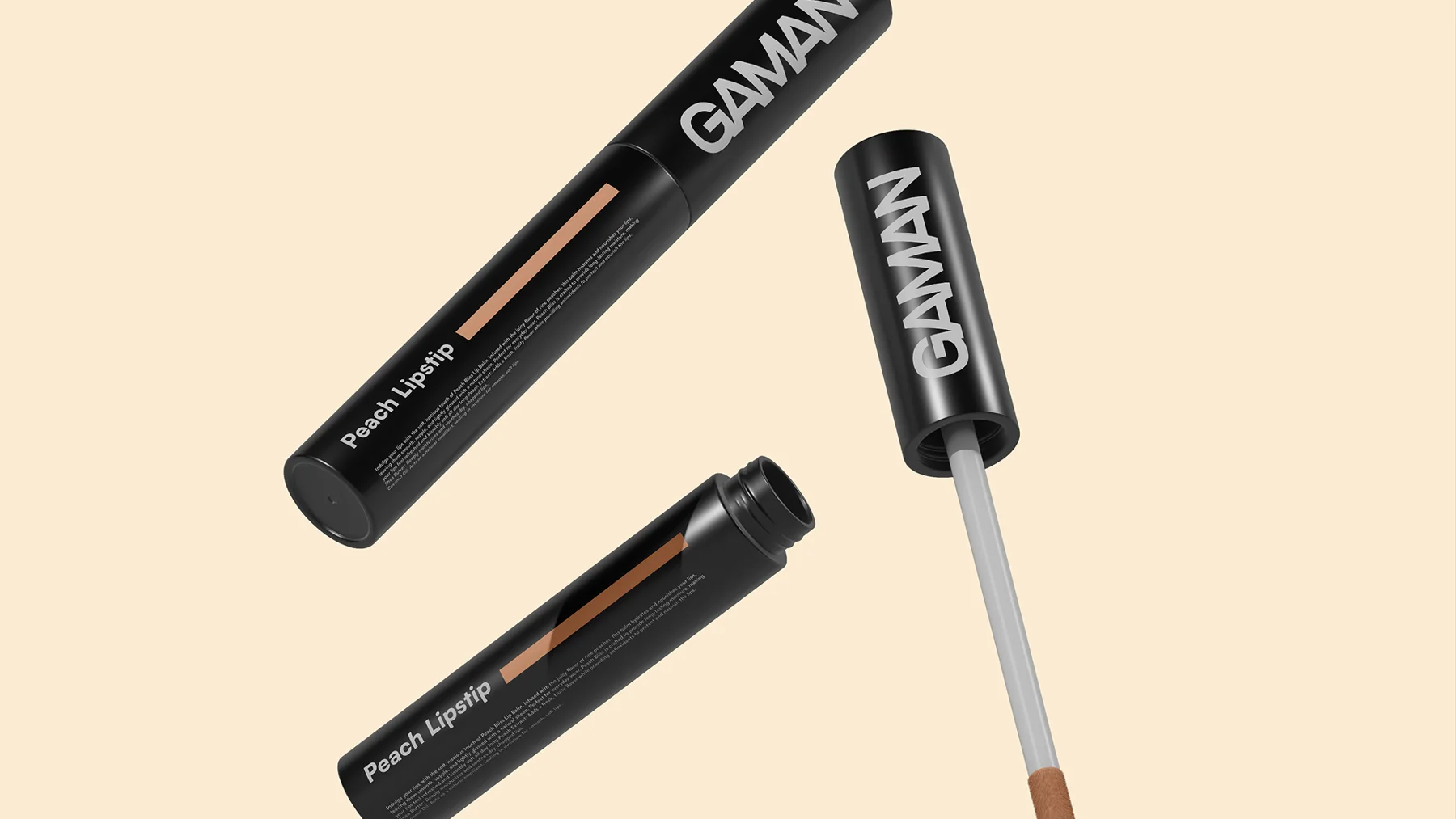
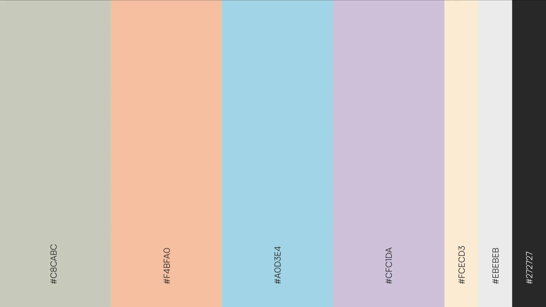
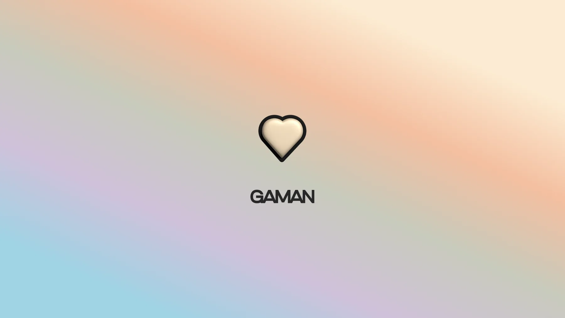
The palette combines pastel variations of blue, orange, green, purple and yellow. Their softness lightens the compositions, while their variety makes room for combinations that fit different products and messages.
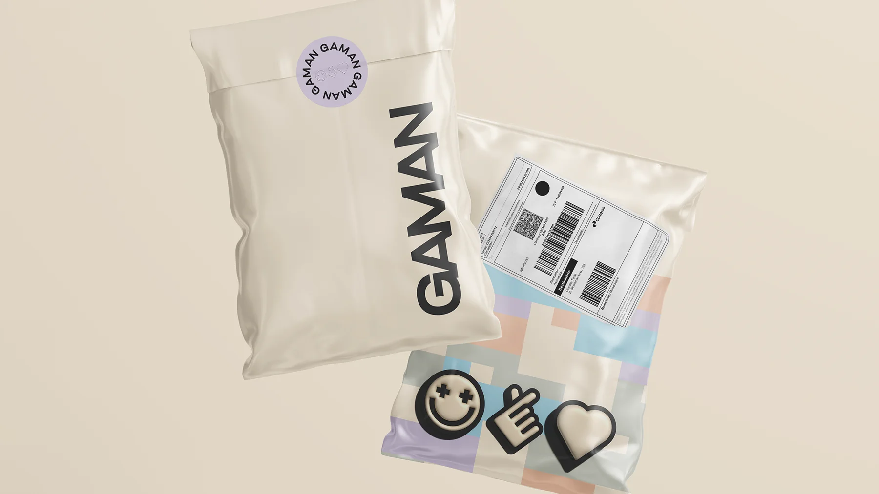
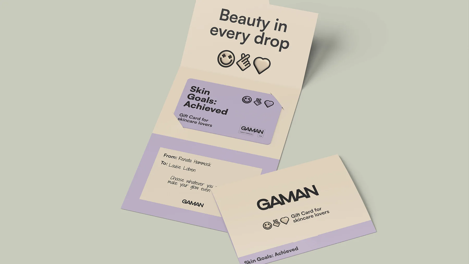
This flexibility makes room for expression on a recognisable foundation. Across packaging, campaigns and social media, the colours build Gaman's presence around the products it offers.
A familiar language for a connected audience
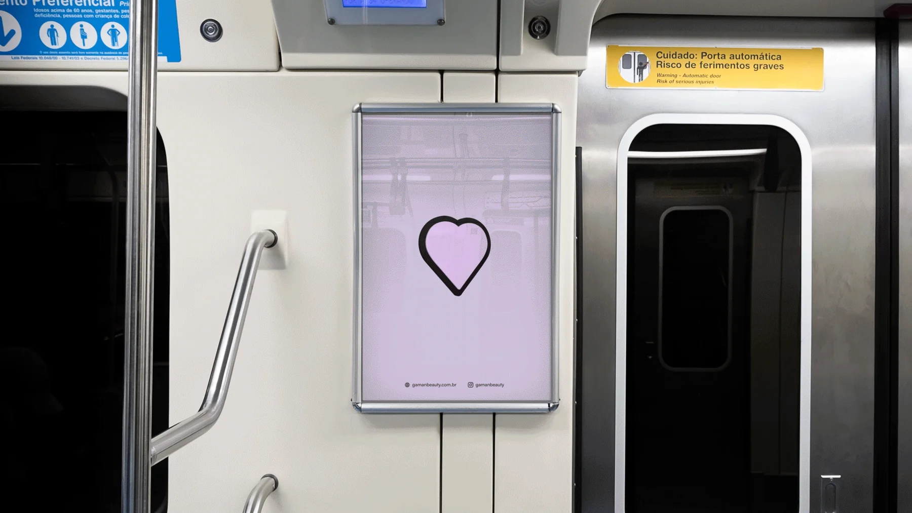
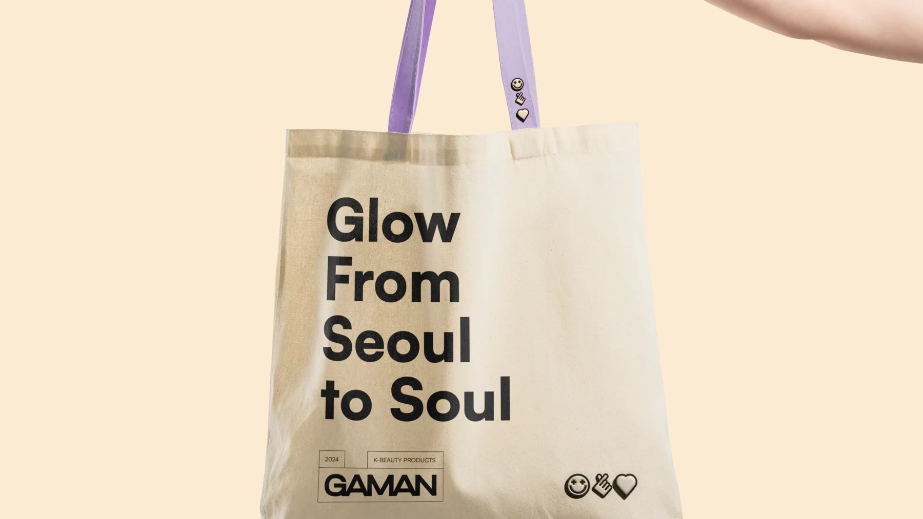
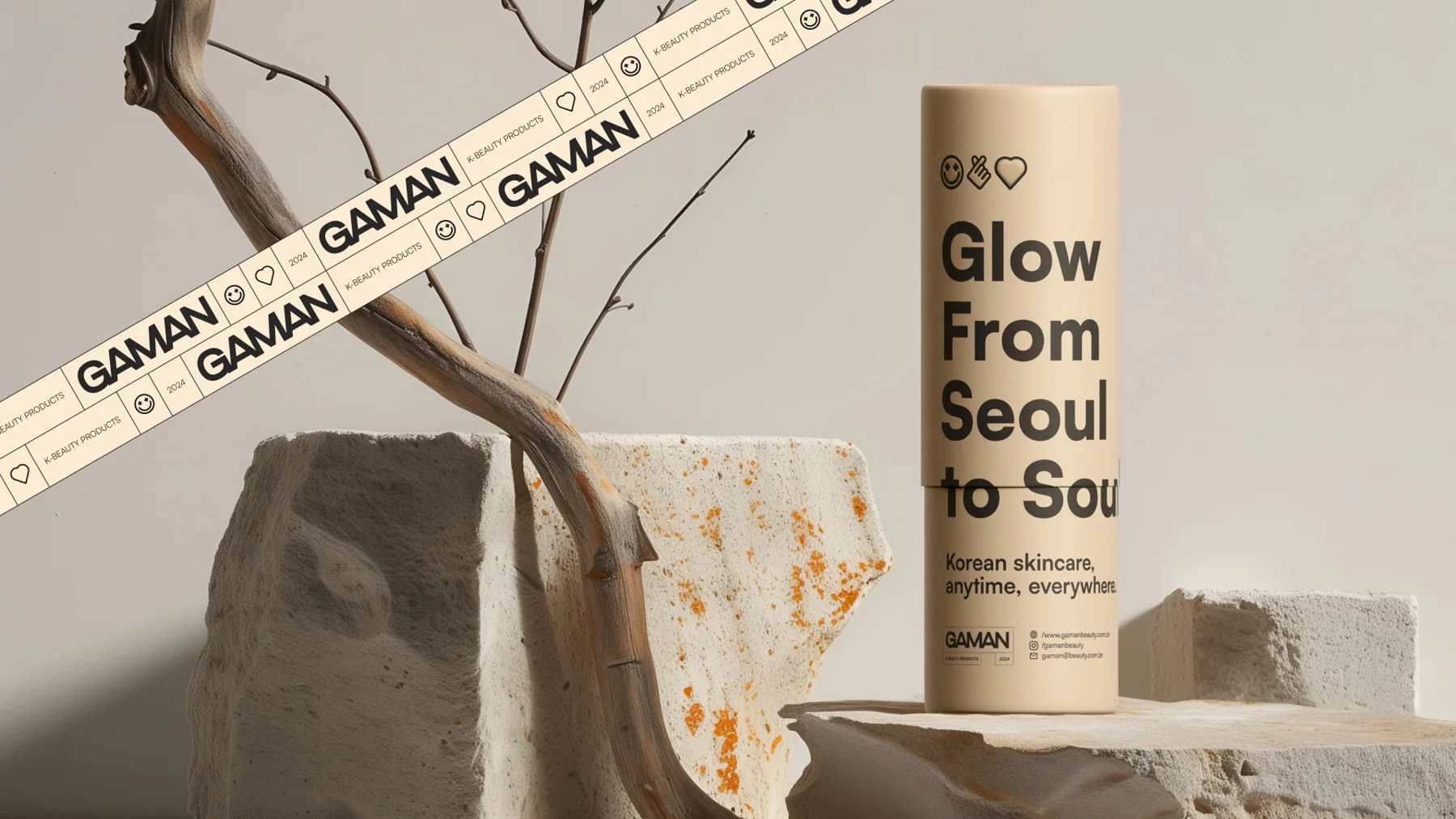
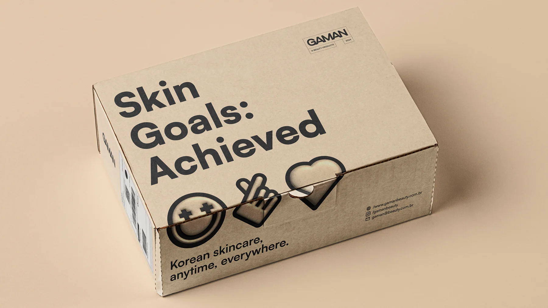
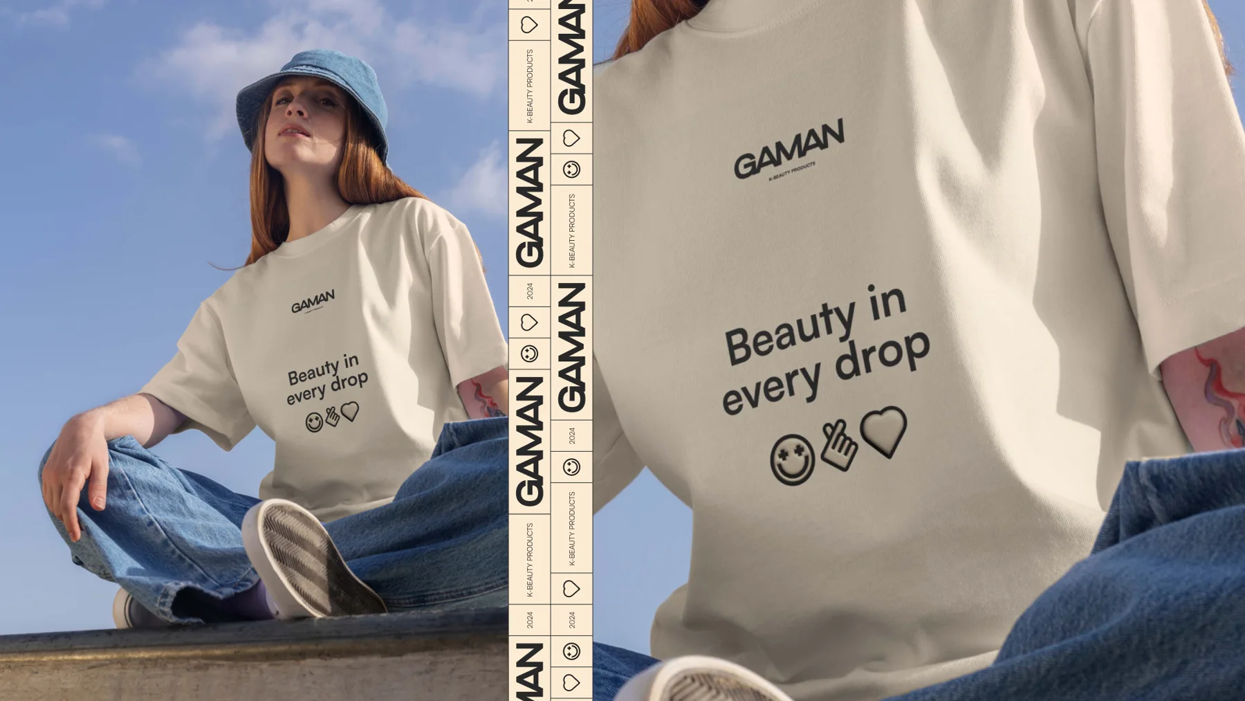
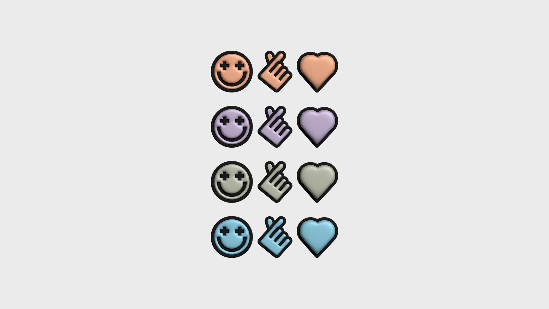
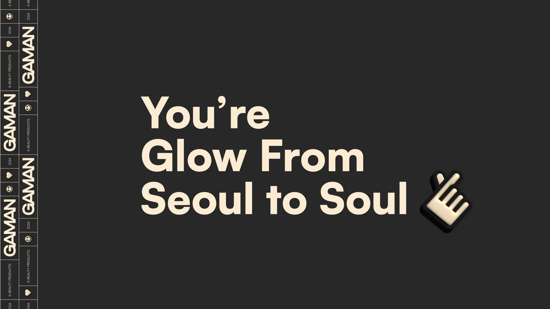
The graphics draw on emojis, signs already used in the audience's conversations. Reinterpreted for the identity, they add expression and humour to the compositions and bring the brand closer to the everyday language of social media.
The contrast between organised layouts and playful graphics gives Gaman a youthful, caring personality. The brand treats skincare as part of the routine and uses design to make the encounter more inviting.