



Ibaero
Training for the people who keep airports running.
An airport relies on people prepared to make decisions affecting the safety of the entire operation. The Brazilian Airport Institute was founded to widen access to specialist training in Brazil, with courses taught by professionals experienced in the sector. It serves people seeking their first opportunity and those already working in the field who want to deepen their knowledge.

The brand challenge
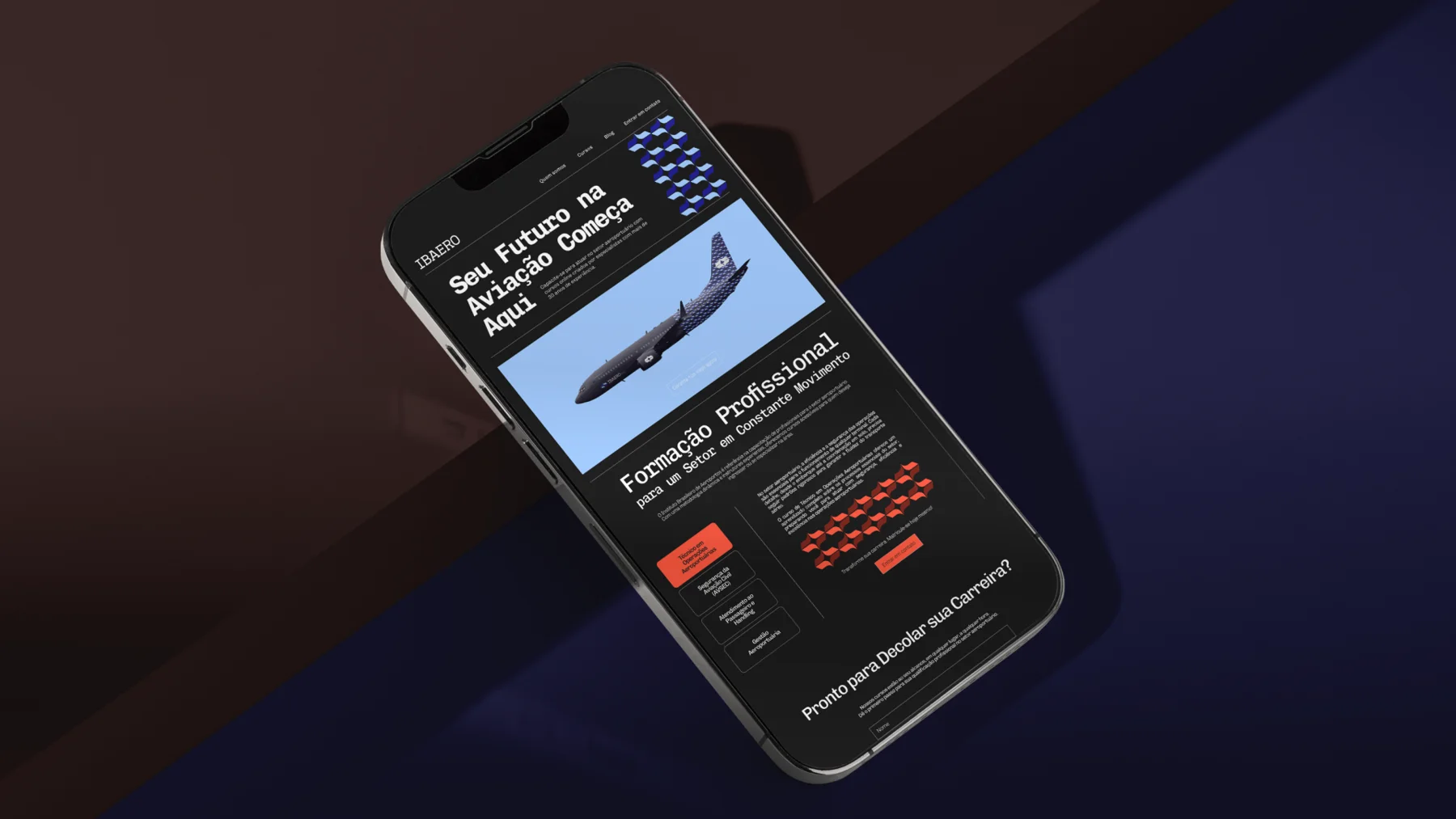
The identity needed to convey the precision the sector demands and make the institution approachable to newcomers. Technical training is the starting point for that relationship. Contact with instructors and exchange among students connect learning with practice and help build professional ties.



The logic of the airport in the visual system
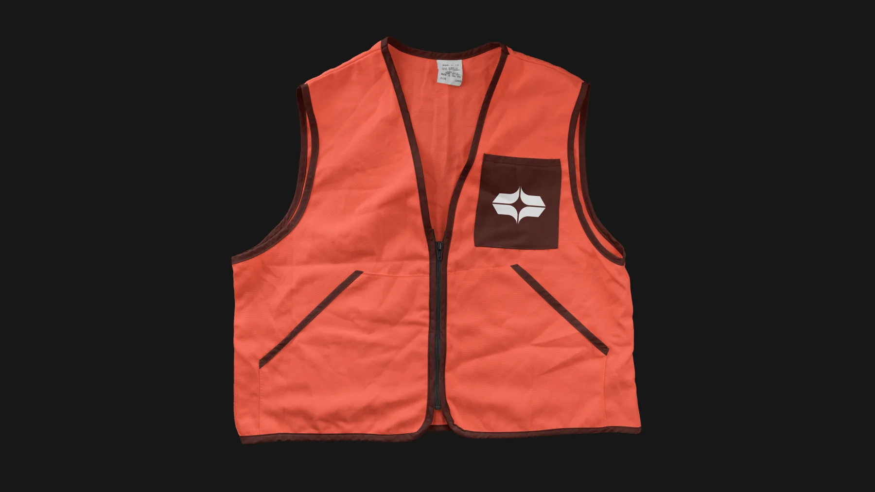
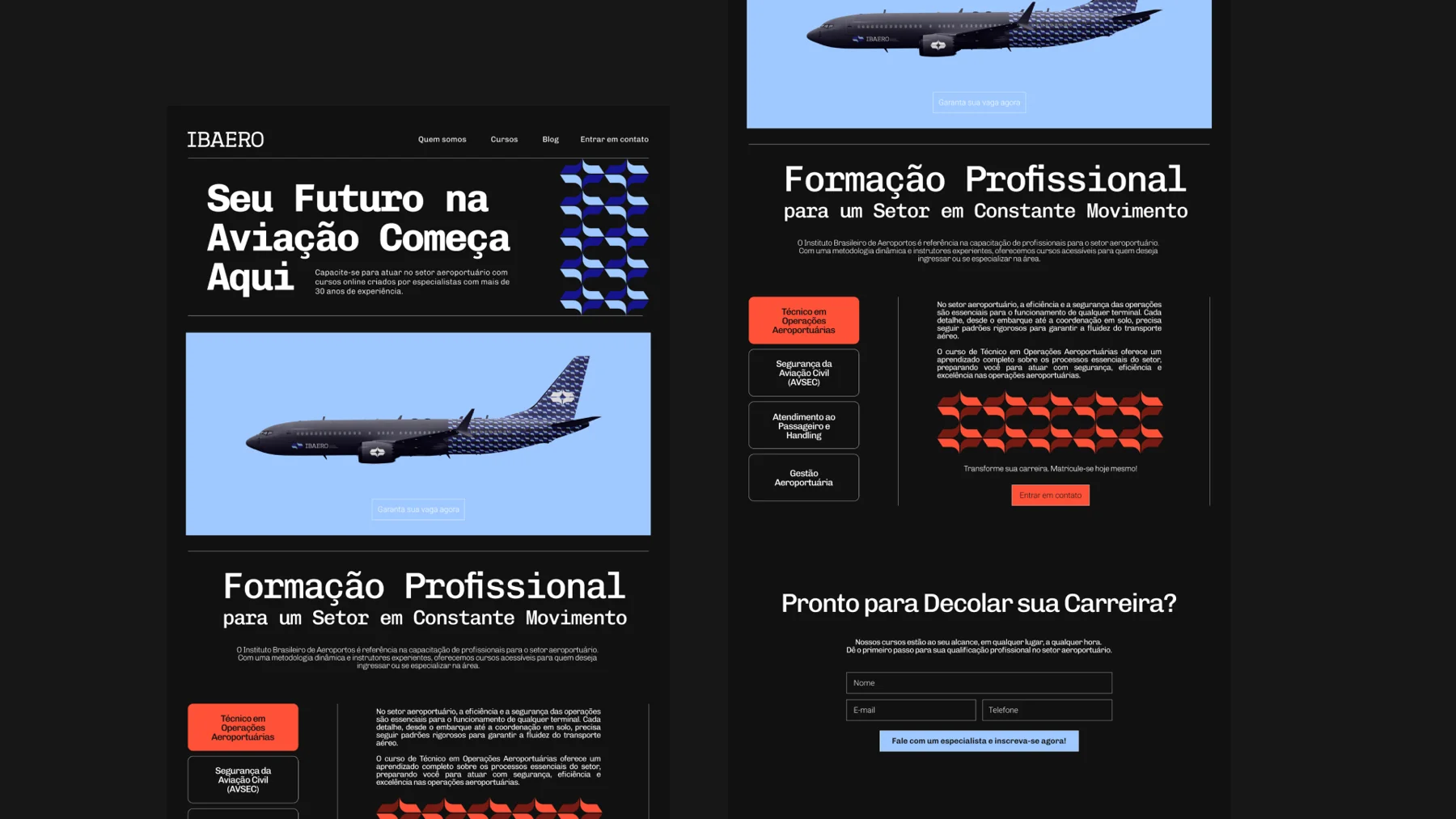
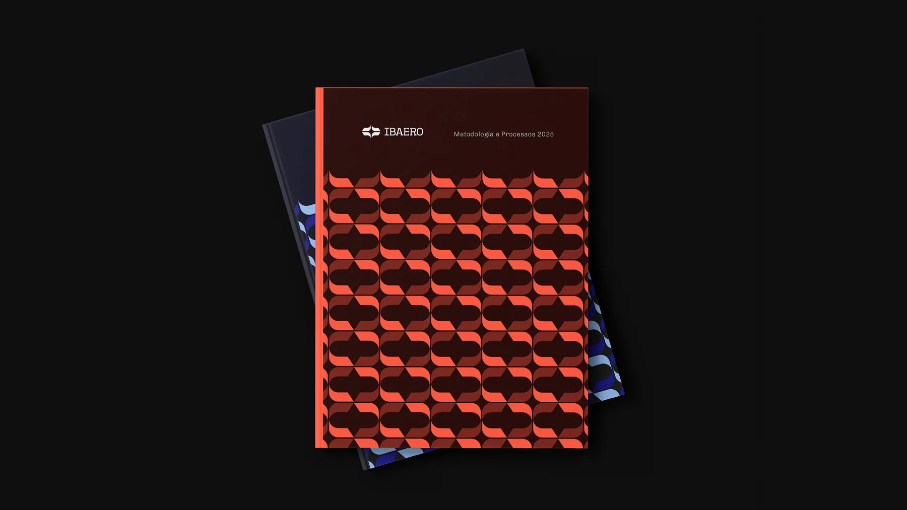
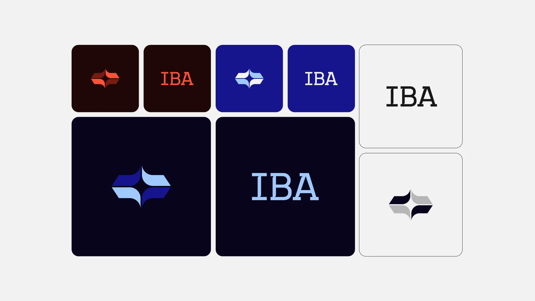
Airport organisation guided how the system distributes information. Deep blue leads in technical materials, certificates and institutional communications. Terracotta red appears in employment initiatives and student engagement. Each colour signals a function and helps identify the type of content across applications.
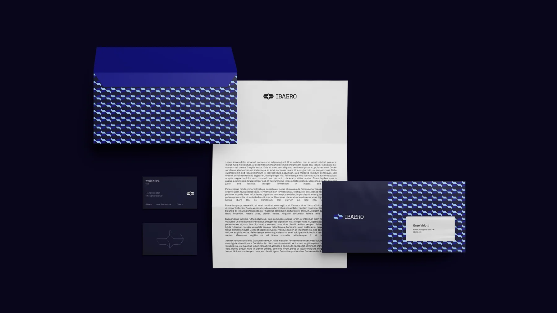
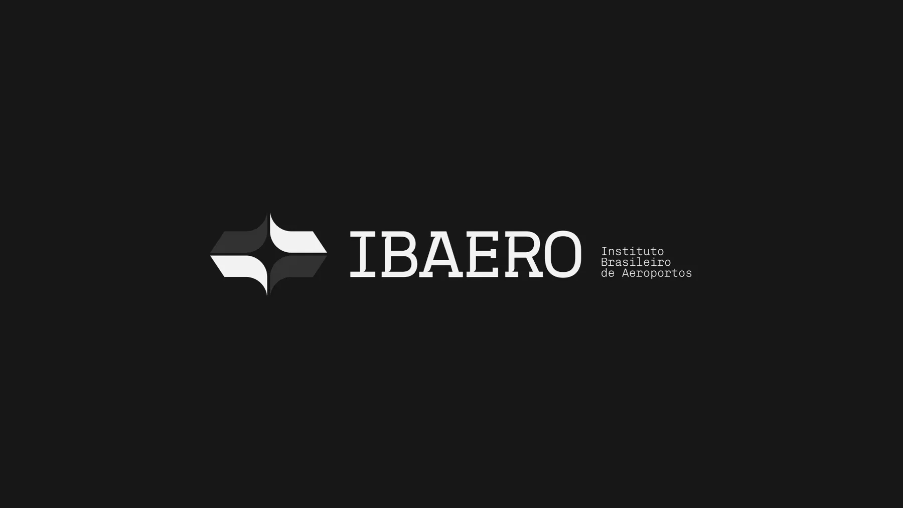
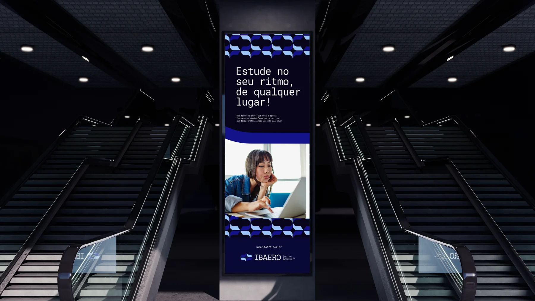
Starting from the logo, we made modular patterns that can sit quietly behind an interface or scale up for a classroom interior. Lines inspired by runways and flight routes complement the system and give the compositions a sense of directed movement.

Precision in the lettering
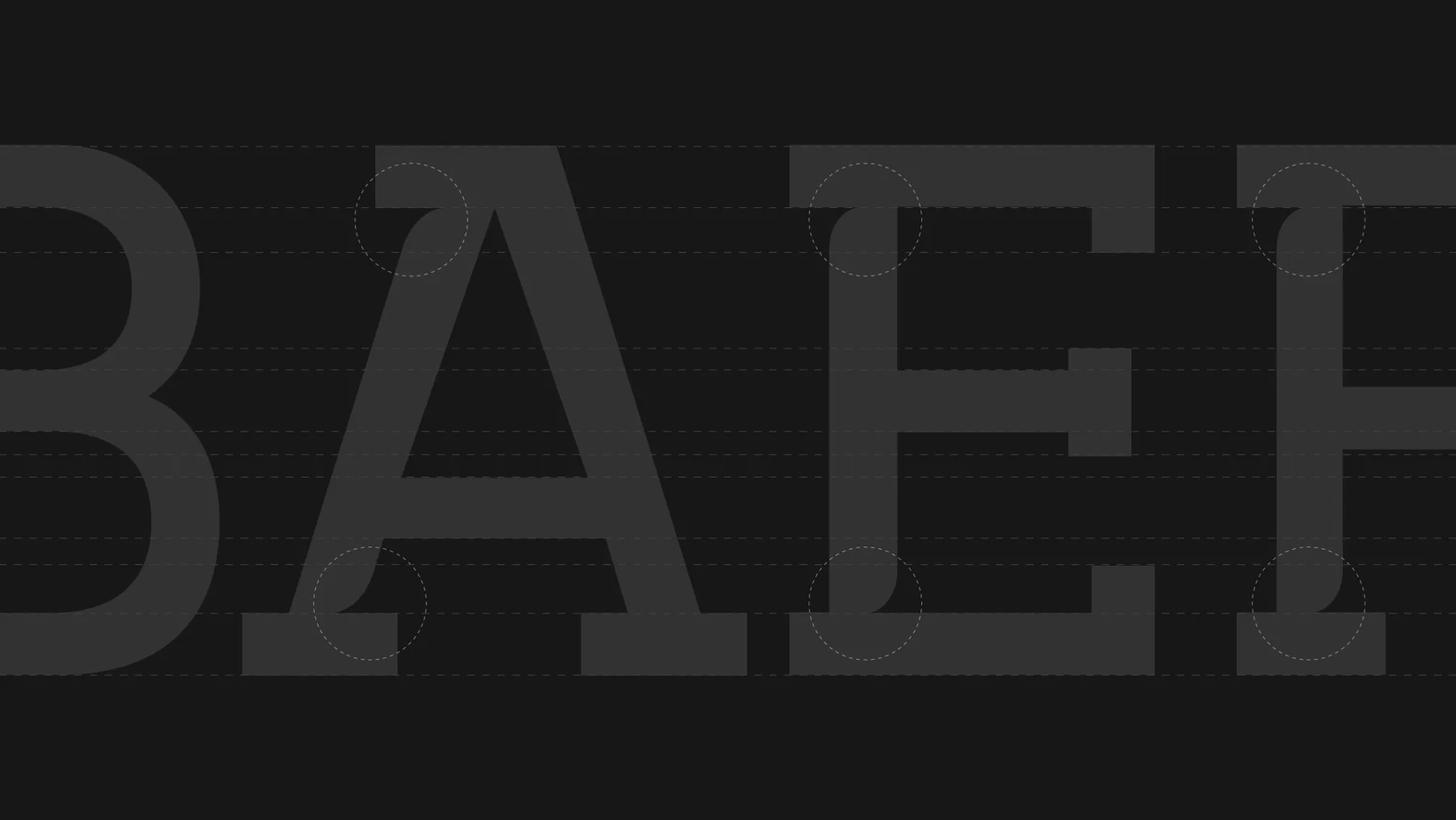
We developed an exclusive serif typeface for headings and key messages. Cuts in the stems and angular serifs echo the geometry of the symbol, tying the brand's writing to the logo. For longer materials, Chivo was chosen for body text and Chivo Mono for headings, giving manuals and digital content a clear hierarchy.