


Kogu
Performance at your own pace.
Kogu considers performance through the rhythms of the body. Its range of extracts brings together reishi, cordyceps and lion's mane, inviting people to learn about the species behind each product.
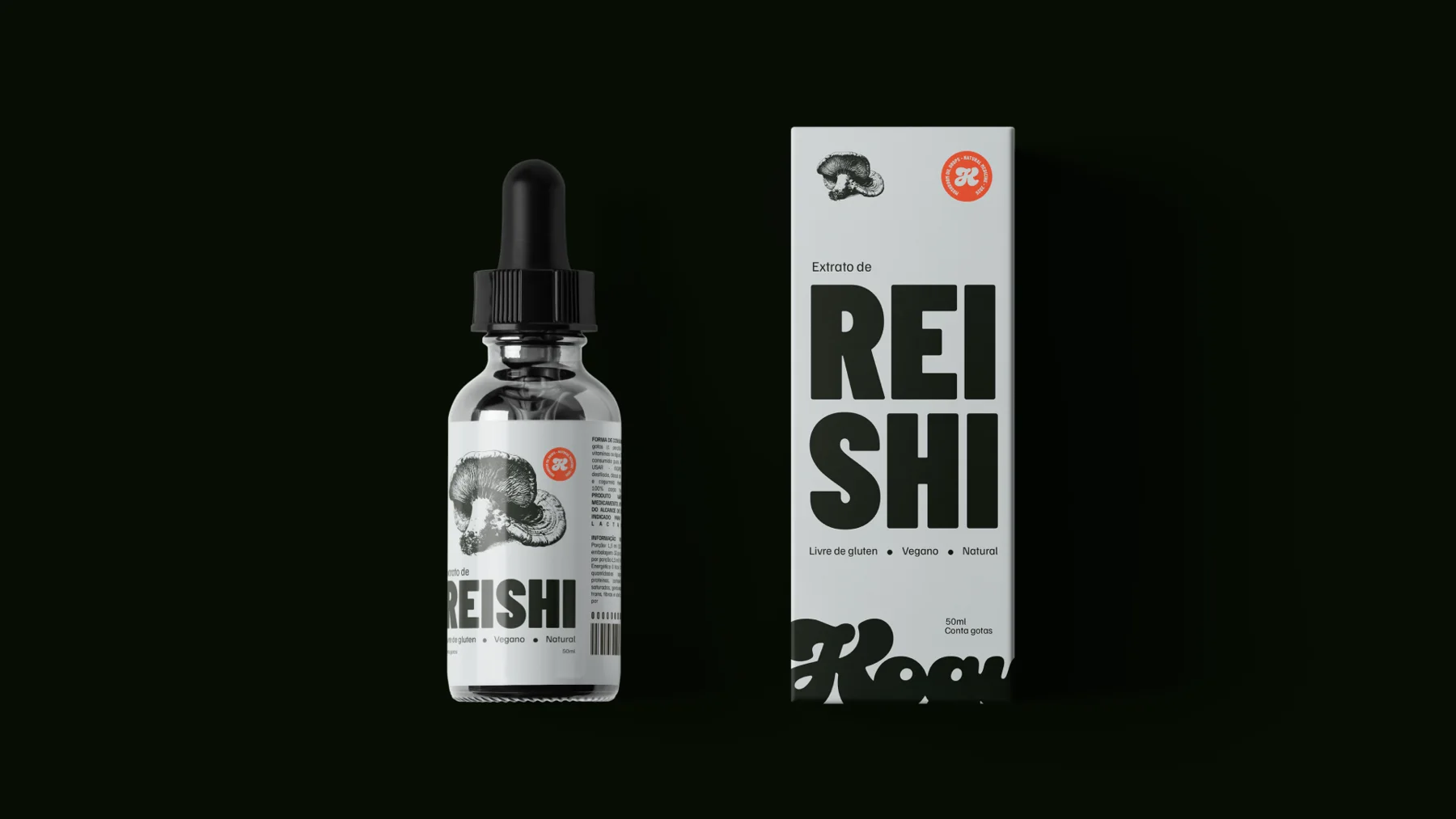
Our work was to give this idea form in a category that still calls for explanation. The packaging needed to spark curiosity while helping people recognise the species and understand what they were picking up at a glance.
Four letters drawn by hand
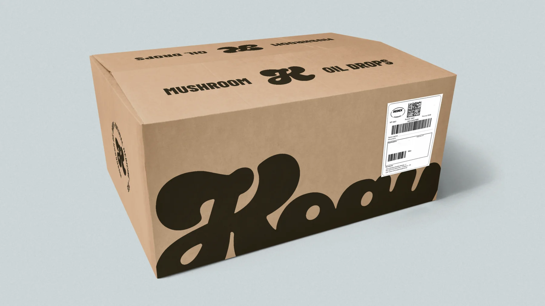
We drew the wordmark letter by letter. We adjusted the stems, curves and spacing so that K, O, G and U would work together, from the label to the screen. Optical refinements made the word consistent while preserving the character of the hand drawing.
On the packaging, Barlow Condensed Bold gives headlines presence in narrow spaces. Familjen Grotesk organises product information and makes the details easier to read.
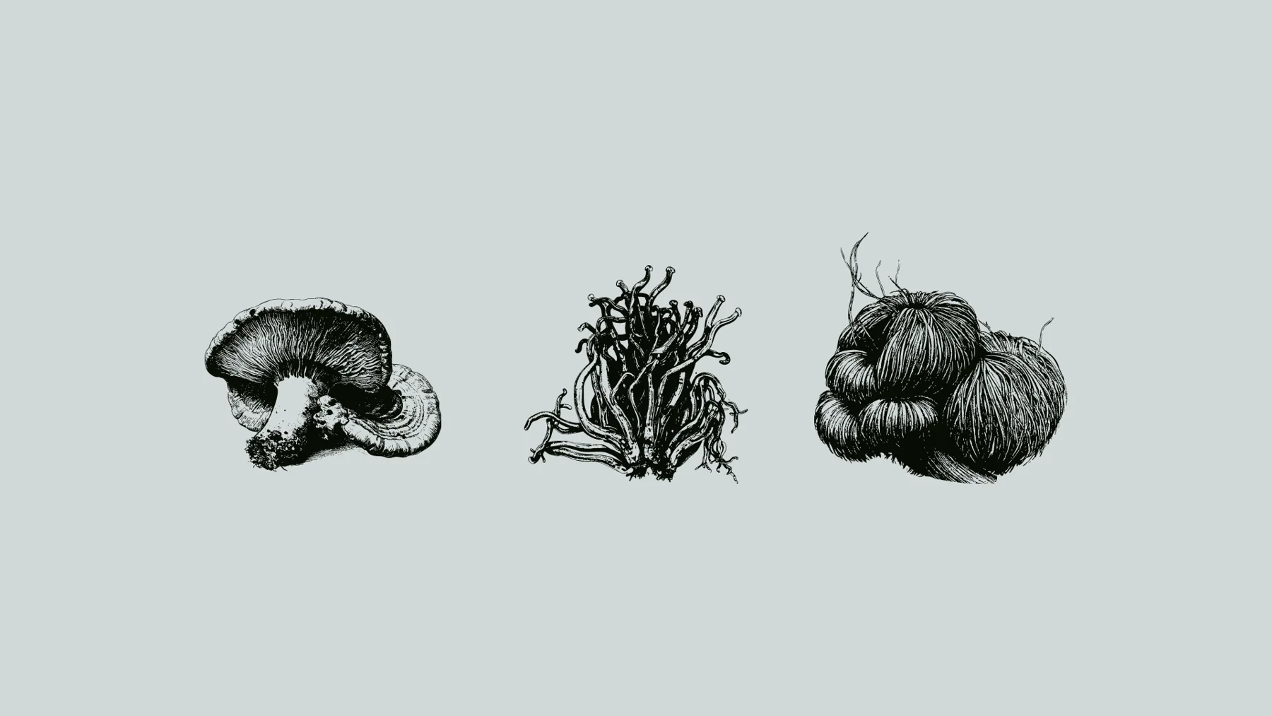
Each species has its own illustration
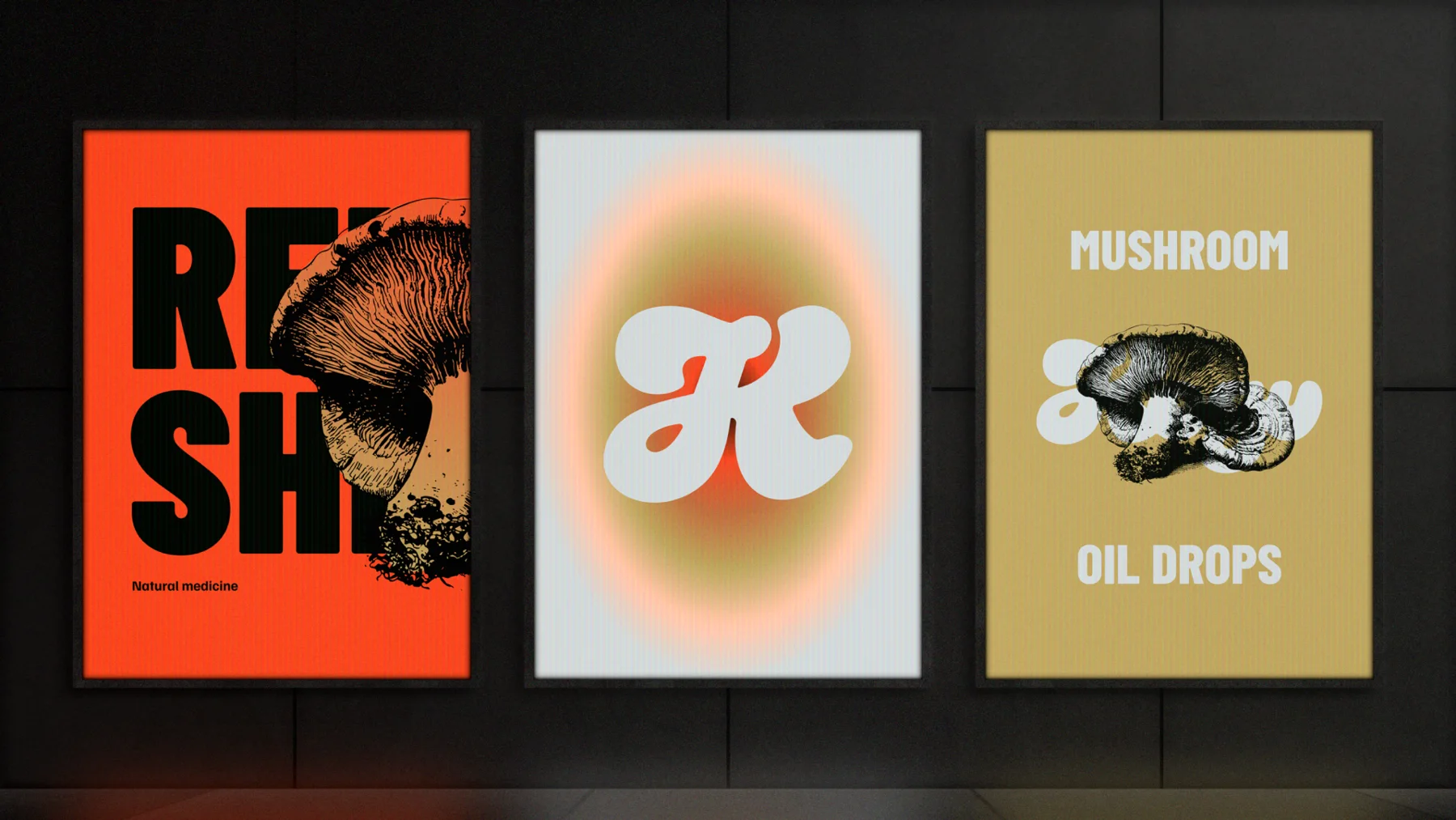
The illustrations draw on classic scientific plates. The lines show the shapes and textures of each mushroom and give the ingredient prominence on the label. Side by side, the packs speak the same visual language, while the drawings help identify each species.

From earth tones to orange
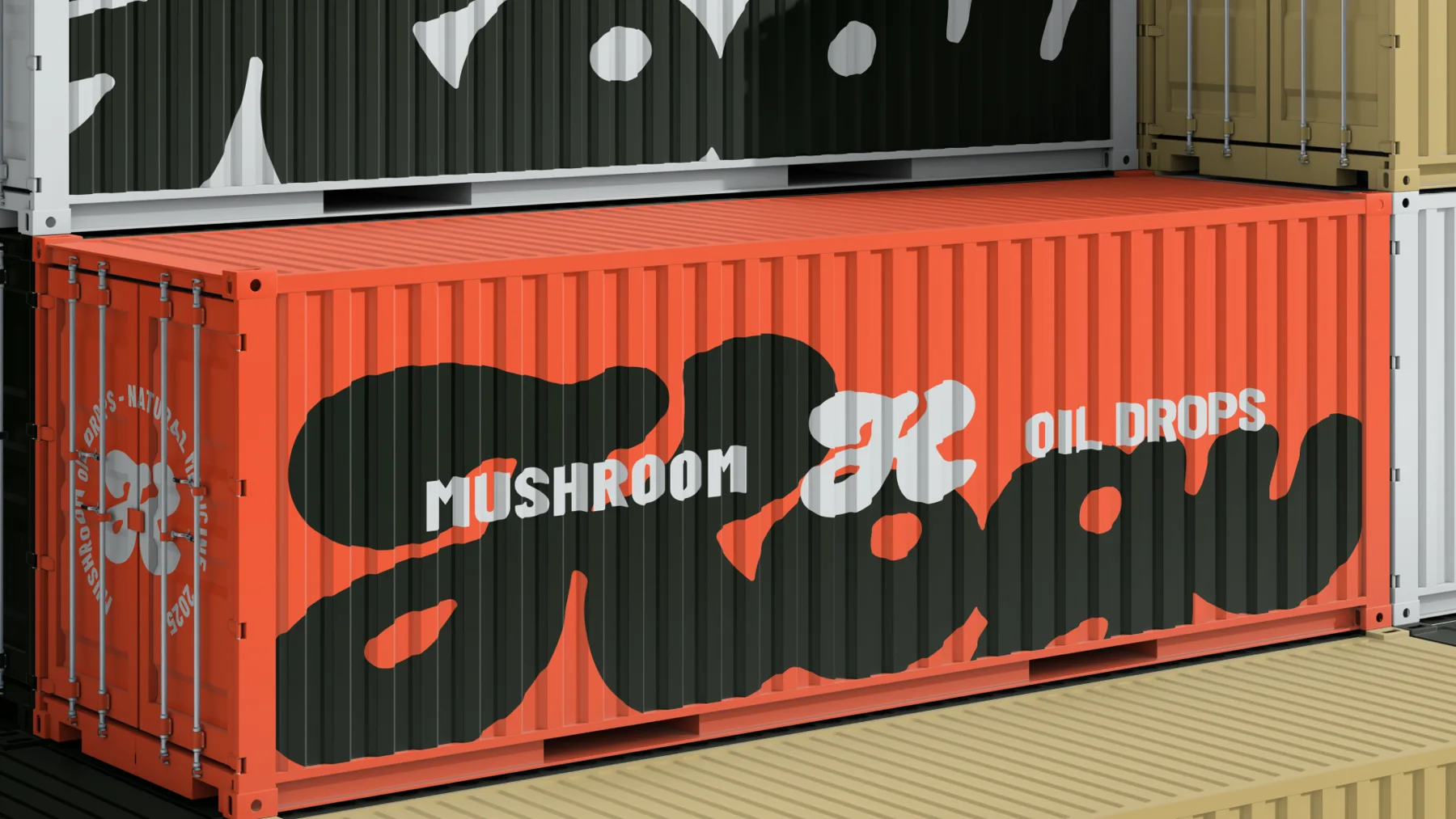
Greenish black and burnt ochre give the identity depth and recall the earth and the conditions in which fungi grow. Bright orange creates the strongest contrast and draws attention to key details. Peach, ice white and amber brown extend the palette from labels to digital materials.